
PDF QR Codes in Print: How to Choose a Size That Scans Reliably
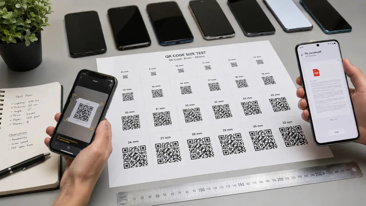
A PDF QR code looks simple from the outside: point a camera at the square, and the document opens. In practice, several quiet failures sit between the printed code and a satisfied reader. The code can be printed too small. A glossy surface can throw glare across the pattern. The linked file can be too heavy to open comfortably on mobile data. A document formatted for a desktop screen can be nearly unreadable on a phone. This guide focuses on the practical question behind all of that: how do you size and prepare a PDF QR code so it scans reliably on real print materials such as flyers, product cards, instruction sheets, event posters, and brochures?
Most QR sizing advice starts with a rough floor. A commonly cited practical minimum for printed QR codes is about 2 x 2 cm for reliable scanning on modern smartphones. That figure is a sensible starting point, but it is a floor rather than a target, and it assumes fairly forgiving conditions: clean matte paper, a close scan, good light, and a recent phone camera. PDF QR codes rarely live in ideal conditions, and they carry an extra expectation, because the user is waiting for a document, not just a web page.
Why PDF QR Codes Deserve Extra Care
Website QR codes usually lead to a landing page. Menu codes lead to a food list. Wi-Fi codes trigger a connection. A PDF code is different because the reader expects a file, and that file might be a manual, catalog, report, checklist, contract sample, event program, product sheet, presentation, price list, or learning material. The scan is only the first step. The real experience begins when the PDF opens.
That distinction matters because a QR code can technically work while the experience still fails. A scan that opens a 40 MB PDF full of tiny text will lose a customer even though the code did its job. A file formatted only for desktop viewing leaves the campaign broken at the last step. So sizing a PDF QR code well is necessary, but it is not sufficient on its own - the document behind it has to earn the scan.
How Size Really Behaves in Print
Size is the single biggest lever for scan reliability, and it interacts with everything around it: scan distance, print resolution, the quiet zone, and the busyness of the layout. A larger printed code gives the camera more visual information to lock onto, which shortens the moment of hesitation when someone raises a phone. On small, cluttered materials that pause is where scans are lost.
As a general rule, the further away a code will be scanned, the larger it needs to be. A useful mental model repeated across QR guidance is a distance-to-size relationship: for every unit of scanning distance, the code needs a proportional amount of physical size. A handout held at arm's length and a poster read from across a room are not the same problem, and a single size will not serve both well.
The practical ranges below are best treated as industry guidance, not laboratory numbers. They give you a safe default per material, which you then confirm with a real printed sample.
- Small handouts, cards, and inserts scanned up close: aim for roughly 2.5 cm and up.
- Flyers and brochures competing with other design elements: roughly 3.5 cm.
- Posters and wall signage read from a standing distance: 5 cm or larger.
The 2 x 2 cm minimum still holds as an absolute floor for close, clean scanning. The reason the practical targets sit above it is that PDF codes tend to appear in busy layouts, on reflective stock, or in places where people scan quickly and expect a document to be worth their time.
PDF QR Codes on Product Instruction Cards
Product instruction cards are one of the most common homes for a PDF QR code, because manufacturers and sellers often prefer not to print a full manual inside every package. A single small card can link to a complete setup guide instead.
The temptation is to make the code as small as possible so the card looks clean. That is usually a mistake on this format. Instruction cards are frequently laminated or printed on glossy stock, and both surfaces introduce glare that eats into the reliability of a small code. A code around 2.5 cm tends to be the first size that feels dependable on real packaging: large enough to give the camera room to work, small enough that it does not dominate the card.
A few habits make these cards work well in practice:
- Do not go below about 2.5 cm if the card may be laminated or printed on glossy stock.
- Make the call to action specific. "Scan to open the setup guide" is clearer and more reassuring than "Scan here."
- Have the code open the PDF directly, without a confusing intermediate page.
- Compress the document so it opens quickly on mobile data.
Used this way, a PDF code lets buyers reach full instructions without forcing the brand to print a bulky manual, which is exactly the kind of print-to-mobile handoff these codes are built for.
PDF QR Codes on Event Flyers and Brochures
Flyers are a harder environment than cards because the code has to share space with a title, date, speaker names, sponsor logos, and a short description. A code that is technically large enough can still underperform here simply because it is hard to notice, or because people need to move the phone closer to catch it. On a crowded flyer that hesitation lowers real-world scan rates even when the code is perfectly valid.
A code in the range of about 3.5 cm generally strikes the right balance on flyers and multi-element brochures: prominent enough to spot and scan in one motion, but not so large that it overwhelms the design. The linked PDF in these cases usually carries the heavier content - a full event schedule, speaker details, a venue map, sponsor information, or a detailed brochure.
Placement and framing matter as much as size on this format:
- Codes tucked into a bottom corner are noticed and scanned less often than codes near the main call-to-action block.
- A short instruction next to the code raises scan confidence.
- Glossy paper increases glare under strong indoor lighting, so it deserves extra checking.
- PDFs with clear headings read better on a phone than dense, brochure-style layouts.
Treat the code as the doorway to the full document, not as a decorative afterthought squeezed into leftover space.
PDF QR Codes on Posters and Wall Signage
Posters change the rules, because people scan them from wherever they happen to be standing, which is usually farther back than a designer expects. A size that is comfortable on a handout can be far too small on a wall. For posters and other signage read from a distance, 5 cm or larger is the safer choice, and bigger is rarely a problem here since the code has room and needs to be seen.
This is where the distance-to-size relationship stops being theoretical. If a reader has to step awkwardly close to the wall to get a clean scan, the code is undersized for its setting, no matter how well it works in your hand at your desk.
The Destination Matters: Keep the PDF Light
When someone scans a website code, they expect a page almost instantly. When they scan a PDF code, they will tolerate a slightly longer wait because they understand a file is loading. That patience is real, but it is short. If the document takes more than a few seconds, most people assume something is broken, and the QR code gets blamed even when the actual culprit is file size.
This is the hidden weakness of many PDF campaigns. The scan can be flawless while a heavy, desktop-oriented file quietly ruins the result. A few file-side rules keep the experience intact:
- Keep the file light. Compress images before you upload or link the PDF.
- Format for mobile. Larger text, short sections, and clear headings are far easier to read on a phone.
- Avoid unnecessary full-page graphics, which slow the file and make reading harder.
- Name the file clearly, since a relevant-looking title makes people trust the document.
- Test opening speed on mobile data, not only on office Wi-Fi.
Many PDF QR tools also let you update the linked document without reprinting and track how often the code is scanned, which is genuinely useful once a printed code is already out in the world.
Matte, Glossy, and Other Surfaces
Matte paper is the most forgiving surface for scanning. Glossy paper looks more polished but reflects light, and those reflections can interfere with a scan under certain angles and lighting. Laminated cards are durable but suffer the same glare, and the smaller the code, the more that glare hurts. Poster paper works well as long as the code is large and printed at high resolution.
The takeaway is not that glossy or laminated materials should be avoided. They are common for good reasons. They simply demand more testing, and often a slightly larger code than the same design would need on matte stock.
Respect the Quiet Zone
The quiet zone is the blank margin around a QR code, and it is easy to sacrifice when a layout feels tight. Trimming it is a common error. Codes with crowded borders scan more slowly, and the effect is worst at smaller sizes where there is little margin for error to begin with. A camera needs clear separation between the pattern and everything around it.
- Keep text off the edges of the code.
- Do not overlap decorative shapes with the pattern.
- Do not crop the white border to save space.
- Avoid placing the code over a busy image background.
That blank margin is part of the code's structure, not spare space to reclaim when a layout runs tight. The same caution applies to styling: colors and logos are fine within limits, and customizing a QR code without breaking the scan covers where those limits sit.
Plan for Older Phones and Mixed Audiences
Recent phones handle small codes and dim light reasonably well. Older devices have a harder time with small patterns, glossy surfaces, and longer distances. This is easy to forget when the person designing a code is holding a new phone. Public-facing PDF codes are not scanned only by people with the latest hardware, though. A business document, museum guide, school handout, product manual, or restaurant brochure reaches a wide range of devices.
For that reason, size for the weakest reasonable scanning situation rather than the best one. A code that only works on flagship cameras in good light is a code that will fail for a meaningful share of your audience.
Suggested Sizes by Use Case
These are conservative starting points, chosen because PDF codes are usually meant to deliver a useful document right away, and a missed scan is a lost reader.
- Business card linking to a PDF portfolio: about 2 cm minimum, 2.5 cm preferred.
- Product instruction card: 2.5 cm preferred, especially on glossy or laminated stock.
- Event flyer: roughly 3 cm to 3.5 cm.
- Brochure with several design elements: around 3.5 cm.
- Poster or wall notice: 5 cm or larger, depending on scan distance.
- Educational handout: 2.5 cm to 3.5 cm, depending on print density.
PDF QR Codes in Education and Training
Education is one of the strongest fits for PDF codes, because they connect printed worksheets, posters, presentations, and classroom materials to digital documents. (We look at the classroom side in more depth in QR codes in education.)
The applications are concrete. A training room code can link to a PDF checklist. A classroom code can open homework instructions. A conference code can replace a printed program. The underlying rule is the same in every setting: the code must scan easily, and the PDF must be genuinely readable on a phone.
What People Do After the PDF Opens
Design for the moment of the scan, because reading behavior on a phone in a hallway is not the same as reading at a desk. In general, three patterns show up once a PDF opens: some people skim it right away and close it, some save it for later, and a smaller group share it through messaging or email. Short documents get read on the spot; long ones mostly get saved. A clear, relevant file name makes people comfortable passing the document along, while poor mobile formatting gets a PDF abandoned within seconds. That makes PDF codes both access tools and, sometimes, distribution tools.
Common Mistakes to Avoid
The most frequent mistake is shrinking the code so the page looks cleaner, which trades reliability for a little visual tidiness. Close behind it is linking to an oversized PDF that stalls on mobile data. A third is placing the code far from any explanation, so people hesitate over what it does. A code paired with a phrase like "Scan to download the catalog" or "Scan to open the setup guide" feels safer and more useful than a bare square.
The last common miss is skipping a test of the final printed item. A digital preview cannot show how the code behaves once ink, paper stock, lamination, and ambient lighting come into play, so a printed sample stays the only dependable check. And if a sample that looks fine still refuses to scan, this troubleshooting guide walks through the usual culprits.
A Pre-Print Checklist for PDF QR Codes
- Generate the code with strong contrast between the pattern and its background.
- Print one real sample before committing to a full run.
- Scan that sample on several phone models, including an older one.
- Test it under the same lighting where people will actually see it.
- Open the linked PDF on mobile data, not only on office Wi-Fi.
- Check that the file's title, layout, and size feel friendly on a phone.
- Ask someone unfamiliar with the document to scan it and describe what they expected.
The technical scan is only one part of the experience. A dependable PDF QR code is large enough for its setting, printed cleanly with room to breathe, placed with clear context, and connected to a document that behaves well on a phone. If you keep small handouts around 2.5 cm, flyers and brochures near 3.5 cm, and posters at 5 cm or more, then confirm it all with a printed sample, most of the common failures disappear before they reach a reader. The code itself takes a minute to generate with a PDF QR code generator; the document behind it is where the real work lives.