
QR Codes vs Short Links on Printed Materials: A Practical Review of What Works Better
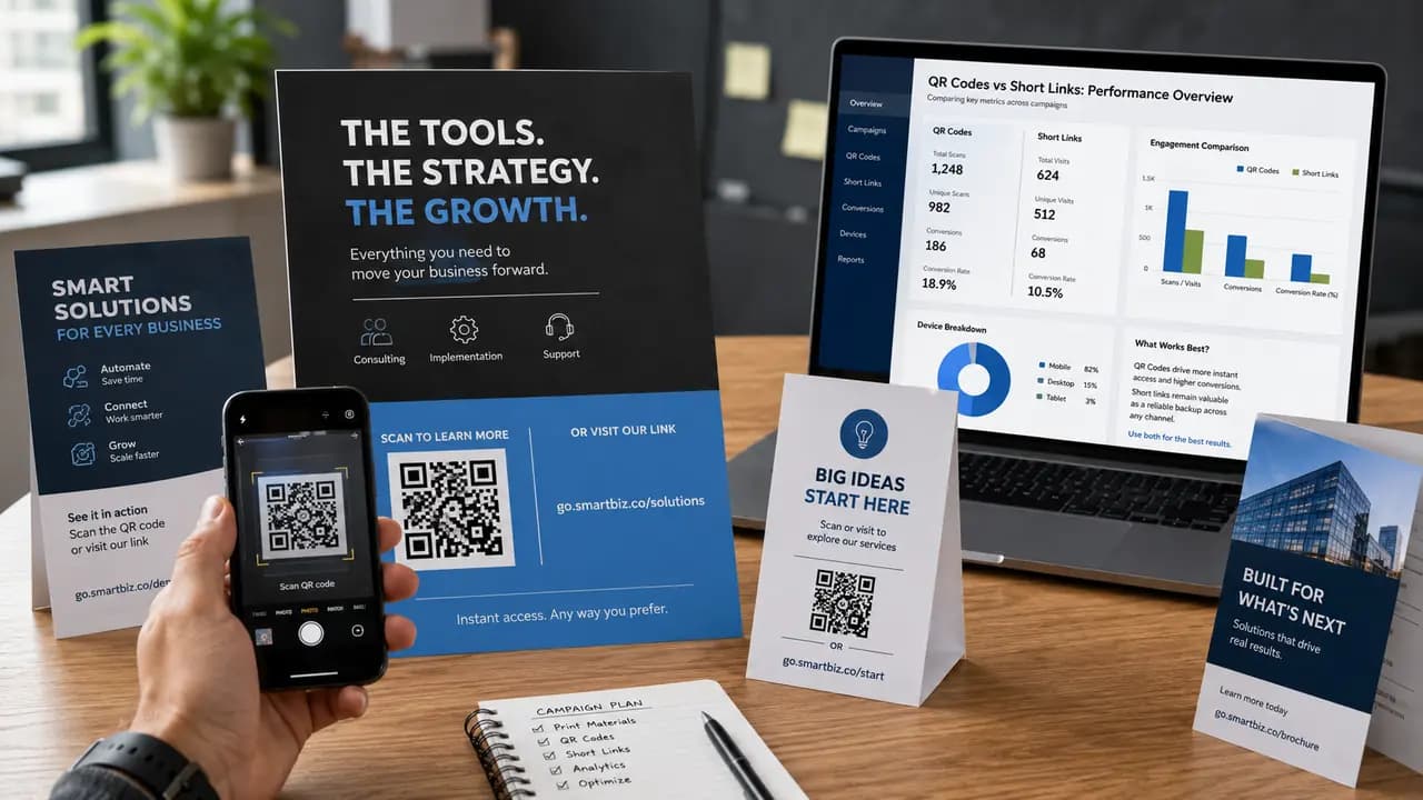
Printed marketing carries one built-in limitation: paper cannot be tapped. A flyer, poster, brochure, table card, product insert, or event badge can earn attention, but the instant a reader wants to cross from the printed page to a web page, some manual effort appears. That handoff, from physical surface to digital destination, is where a lot of campaigns quietly lose people. It is also the reason the QR-code-versus-short-link question keeps resurfacing every time a new print run is designed.
This QR-ScanMe article is a practical review, not a proprietary study. We did not run a controlled field experiment, and we do not report scan rates from a test that never happened. What follows is guidance drawn from how printed materials are actually used, from publicly documented QR behavior in retail, and from the everyday logic of moving someone from a printed surface to a working link. A practical review can be genuinely useful, but it should never dress itself up as measured data unless the raw numbers, dates, methodology, and authors are on the table.
The Real Question: Instant Action or Later Access
QR codes and short links answer the same need in opposite styles. A QR code is built for the moment a reader already has a phone in hand and wants to reach a destination immediately. A short link is built for the case where someone wants to remember, type, copy, or return to the address later, possibly from a different device. Neither is automatically superior. The right choice depends on where the material lives and what the reader is most likely to do while looking at it.
It helps to picture the reader's context rather than the code itself. A guest seated at a table, a shopper holding a package in a store aisle, and a commuter glancing at a poster are all in different states of attention and readiness. A QR code rewards the reader who is ready to act on the spot. A short link rewards the reader who is not ready yet but might act soon. Most disagreements about which format to use disappear once you decide which of those readers you are designing for.
How Scanning Behavior Actually Works
A QR code only pays off when three conditions line up: the reader has a capable phone nearby, the code is large and clean enough to scan at the viewing distance, and the reader has a reason to act right now. Modern phone cameras recognize codes natively, so the tool barrier is mostly gone. The remaining barriers are physical and motivational. A code printed too small, placed too high, tucked behind glare, or surrounded by clutter will fail even when the reader is willing.
Short links carry a different set of trade-offs. They demand typing, which is slower and error-prone, especially on small on-screen keyboards. In exchange, they are readable, portable, and reassuring. A person can see roughly where the link goes before committing, can write it on a notepad, or can send it to someone else in a message. Understanding these mechanics is what lets you match the format to the surface instead of guessing.
Where QR Codes Usually Make More Sense
QR codes tend to win on surfaces where the reader is close, phone-ready, and expected to respond in the moment.
- Restaurant and cafe tables. Guests are already holding their phones, and typing a URL between courses is an obvious annoyance. A code on a table tent or menu card moves them straight to the digital menu, a review page, or a loyalty signup.
- Wi-Fi and access signs. Encoding network details in a Wi-Fi QR code removes the worst typing task most people face in a venue: entering a long, case-sensitive password by hand.
- Event posters, tickets, and badges. Attendees often need fast access to a schedule, a map, a session page, or a registration form while standing in a hallway or a queue. A badge that carries a scannable link also doubles as a lightweight networking tool.
- Product packaging, inserts, and manuals. Setup guides, warranty registration, tutorial videos, and full documentation are natural fits. Printing an entire manual is expensive and quickly outdated, while a code can point to a page that stays current.
- Time-sensitive printed offers. When the whole point is an immediate response, such as a limited discount or a launch-day promotion, the code that opens the destination in seconds carries the campaign.
The shared advantage across these cases is that scanning removes typing at the exact moment when attention is fragile. Printed URLs ask the reader to do extra work precisely when they are least inclined to, and every added step trims the number of people who follow through.
Where Short Links Still Matter
Short links keep their value on materials that get kept, carried, or handed along.
- Direct mail and leaflets saved for later. A postcard pinned to a fridge or dropped in a drawer may be revisited days later, often from a laptop where no camera scan is involved. A readable link survives that delay.
- Business cards. Cards are frequently filed, photographed, or typed into a contact record. A clean short link reads as a professional detail and stays usable even when someone is entering it manually into a browser on a full keyboard.
- Materials that pass between people. When a brochure or insert is likely to be shared, a link that a person can dictate over the phone or paste into a chat travels more easily than a code the next person has to physically point a camera at.
- Contexts where transparency builds trust. Some readers prefer to see where a link leads before opening it. In cautious audiences or regulated categories, a visible destination can lower hesitation in a way an opaque code cannot.
Short links are weaker for instant action, but they are far from old-fashioned. They function as a reliable backup and as the better primary choice whenever the printed piece is meant to outlive the moment it was handed over.
What Public Research Can and Cannot Tell Us
There are real studies showing that QR codes can influence consumer behavior, but they should be cited carefully. Research on QR codes for milk shelf-life information found that QR-labeled containers were used in a retail setting and that scan behavior was lower than total sales activity, which means scans should not be treated as identical to purchases.
Another summary of the same research notes that QR-labeled milk containers attracted consumer interest. That is a meaningful signal, but it does not prove that every printed QR campaign will produce the same outcome. The honest reading is that codes can draw attention and shape behavior in the right context, not that they guarantee a fixed result on any surface you choose. Treat published findings as directional evidence, and treat your own printed piece as its own case that still needs testing.
Why Combined Layouts Are Often the Safest Choice
For a large share of printed campaigns, the most forgiving design is not one format or the other. It is both, arranged so each serves the reader it fits best.
- The QR code serves immediate users. They scan and move directly to the destination without typing.
- The short link supports delayed users. They can type it later, use it from another device, or pass it to someone else.
- The layout becomes more resilient. If a scan fails because of glare, distance, a damaged print, or an awkward camera angle, the reader still has a second path instead of a dead end.
At a cafe table, asking someone to type a link when a code is sitting right in front of them adds friction for no reason. On a product insert kept for weeks, the readable link is the piece that survives. A combined layout lets you stop guessing which reader will show up, because you have quietly served both.
Design and Layout Tips for Combined Use
Putting both on the page only helps if the hierarchy is clear. A few practical habits keep a combined layout from becoming cluttered.
- Lead with the format that matches the surface. On a table card, make the code the visual anchor and place the short link beneath it as the fallback. On a mailer meant to be saved, let the link read comfortably and treat the code as the fast option.
- Give the QR code room to breathe. Keep a clear quiet zone around it and avoid crowding it with text or graphics that a camera might catch in frame.
- Respect a sensible minimum size. Codes smaller than about two centimeters on a side get unreliable, and posters need considerably more; our print sizing guide has targets per material.
- Write a short, explicit instruction. Lines like Scan to view the menu, Scan to register, or Scan for setup help tell the reader what the action does and why it is worth doing.
- Keep the short link genuinely short and clean. A long, messy URL undermines the whole reason for offering a typed fallback.
- Make sure both routes land on the same fast, mobile-friendly page. A slow or broken destination erases the advantage of either format.
Testing Before You Commit to a Print Run
The single most useful habit is to test the physical version, not just the file on screen. Print a proof at the real final size and scan it with more than one phone, ideally across different camera qualities and both major mobile platforms. Check it under the lighting the reader will actually face, since glossy stock and overhead light can create glare that a monitor never reveals. Confirm the code scans from the distance the reader will stand at, which is very different for a table tent versus a wall poster. Type the short link by hand to make sure it is easy to enter without errors. If anything about the destination or the layout is likely to change, test again after the change rather than trusting the earlier proof.
QR codes are usually the stronger choice for immediate action on printed materials, while short links work better as a saved-for-later backup. For many campaigns the most dependable structure is a QR code first and a short link second, sized and placed with care and checked on real devices before the full batch prints. The code is the cheapest part of the layout to get right - generating one takes less time than proofreading the flyer - so the attention belongs to placement, the destination, a readable backup link, and a real reason for the reader to act.